Typography
During my internship, I worked on creating typography for the Reliance Jewellery Punjab collection. We were tasked with designing iconography that highlights key aspects of Punjab, drawing inspiration from motifs like Mohrakashi, the Golden Temple, Phulkari, agriculture, Paranda, lotus domes, and the Kirpan. This iconography played a crucial role in developing the typography for the jewelry collection, as these elements served as the foundation for crafting the typefaces. The goal was to creatively blend these cultural motifs, giving the typography a unique visual identity that truly captures the essence of Punjab.
Inspiration
Final Typography Exploration
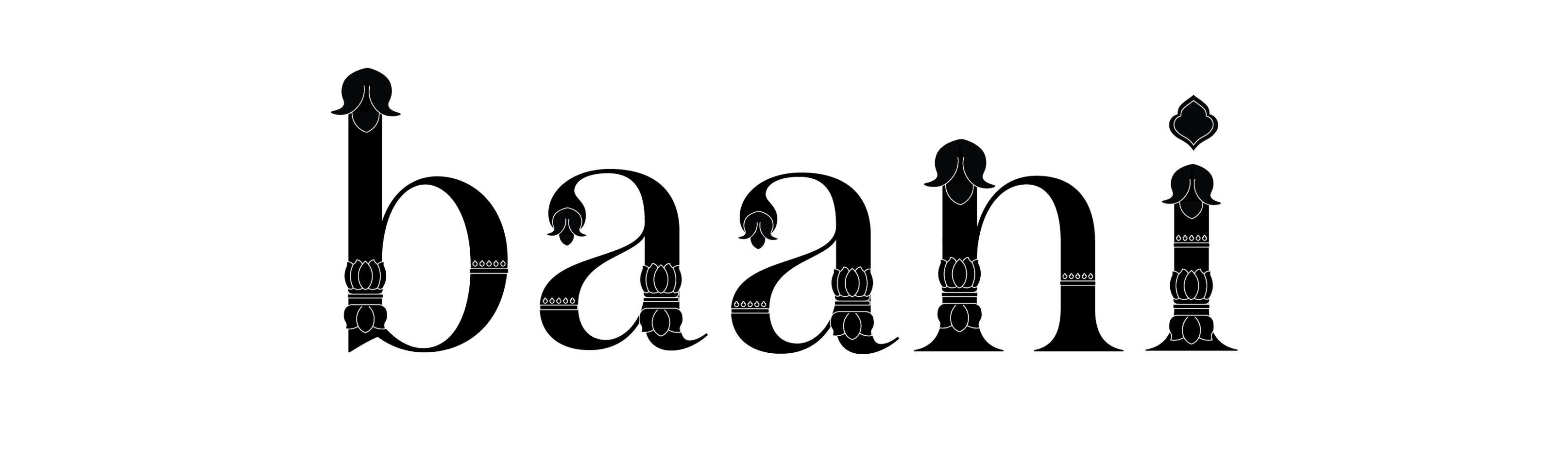
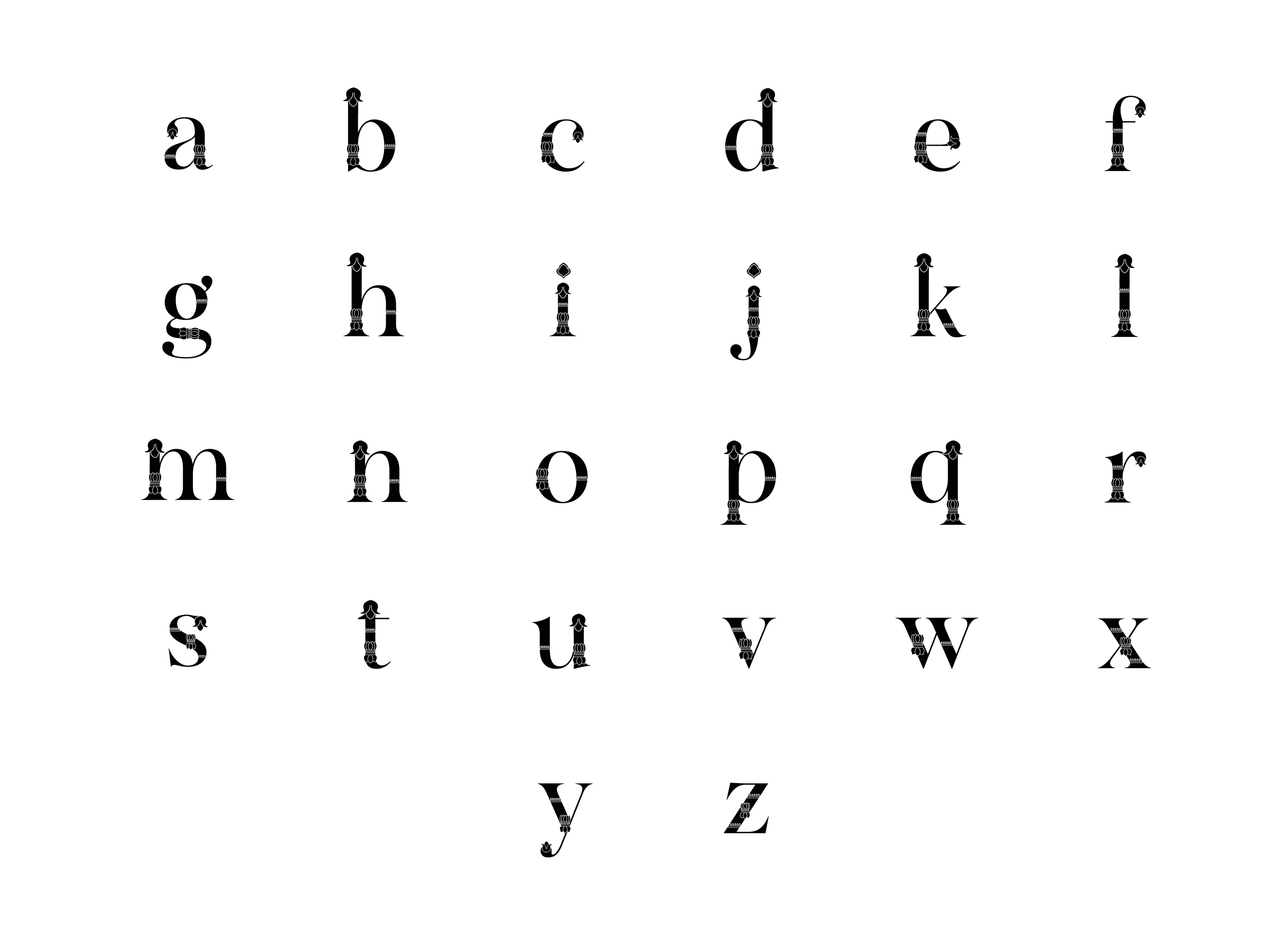
For my typography, I drew inspiration from tracings of Mohrakashi, the Golden Temple, and lotus domes, which were the key elements I used to create the typo design. I selected Salina as the base font, opting for a serif style to impart an elegant touch to the typography.
For the final typography I drew inspiration from the above tracings. Our aim was to develop a typography that creatively embodies Punjab, using elements that represent the state's unique culture. I incorporated motifs like those found in Mohrakashi, the Golden Temple and lotus domes. By tracing and exploring these elements, the typeface was crafted capturing the essence of Punjab, giving it a distinctive visual identity. The below typography is an exploration for the Relaince Punjab Jewellery Collection.