Ponyo
Through Ponyo (Kids Brand) we wanted to evoke a sense of playfulness and comfort tailored specifically for our young audience. Taking inspiration from the red panda, our approach is centered on infusing the logo with a rich color scheme, soft shapes and a welcoming typography. Our goal is to craft a visual identity that serves as a friendly companion to children. By prioritizing warmth and approachability in our design, we aim to establish a connection with kids, ensuring that Ponyo becomes a cherished part of their childhood memories.
Ponyo is driven by the goal of empowering children to become champions of environmental sustainability. Our purpose is to instill in them a deep sense of responsibility towards our planet by providing eco-friendly products that facilitate a profound connection to nature. We believe that by fostering this connection early on, we can inspire a generation of environmentally-conscious individuals who are committed to making positive contributions to the health of our planet.
Design Approach
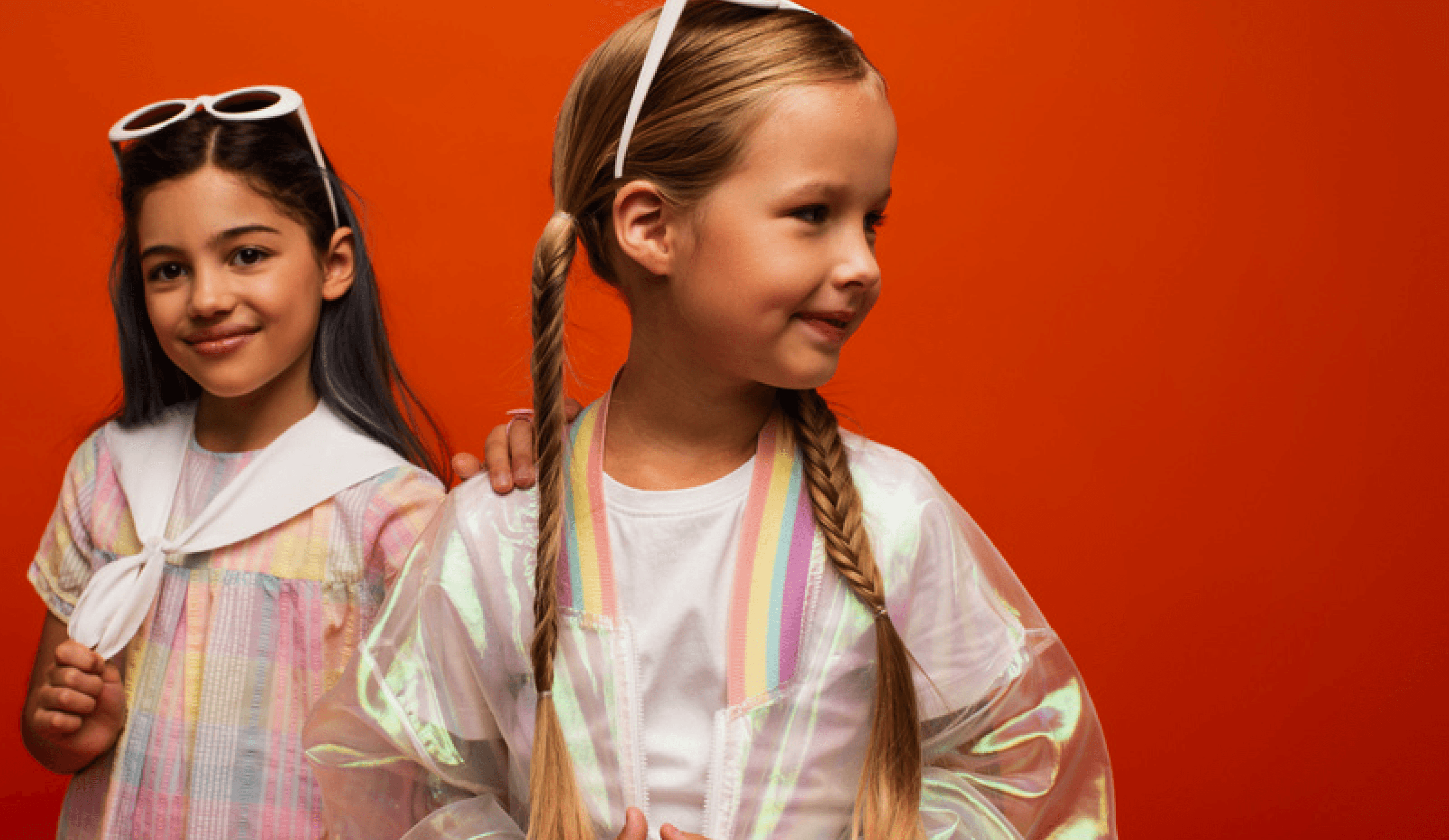
Primary Target Audience
Secondary Target Audience
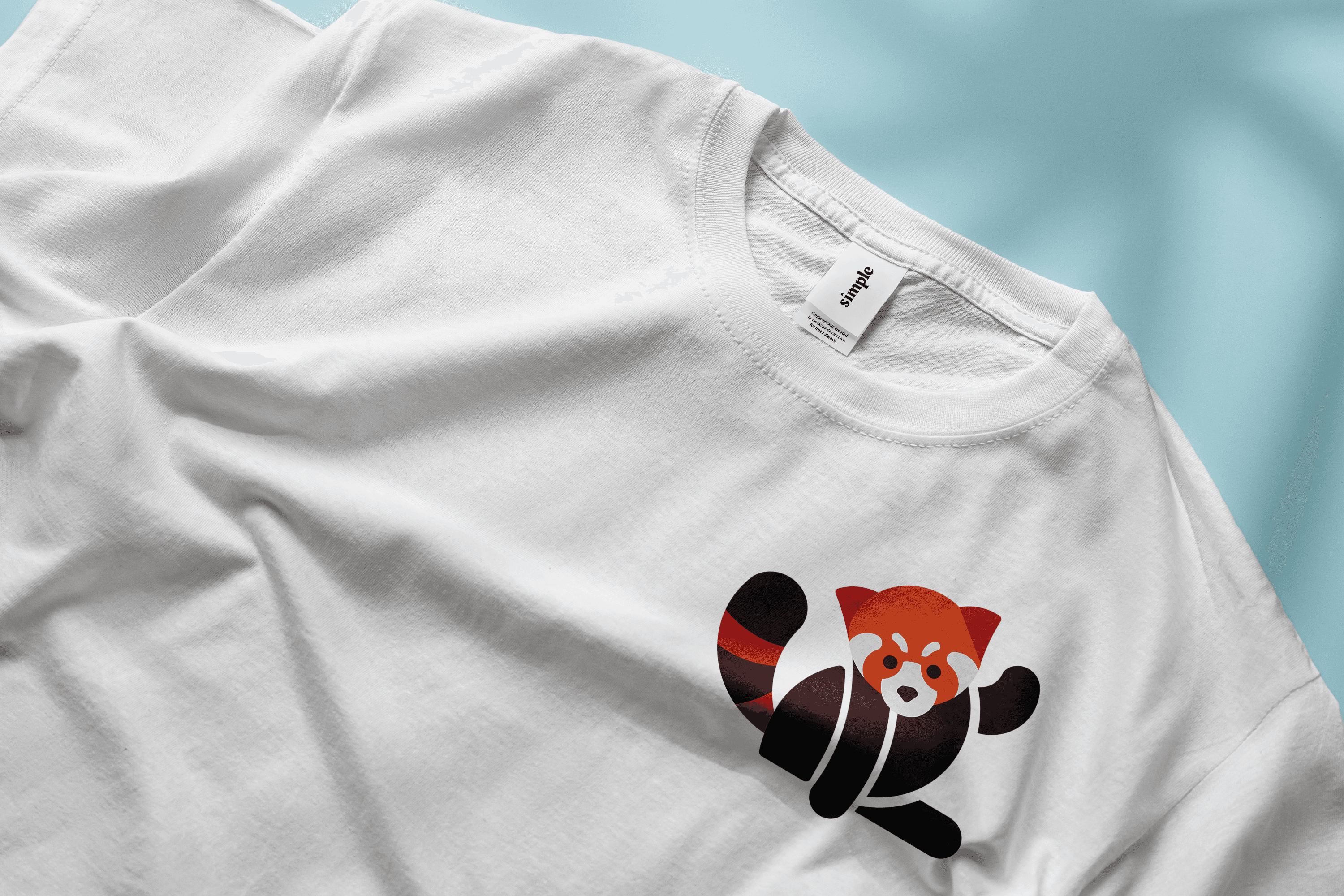
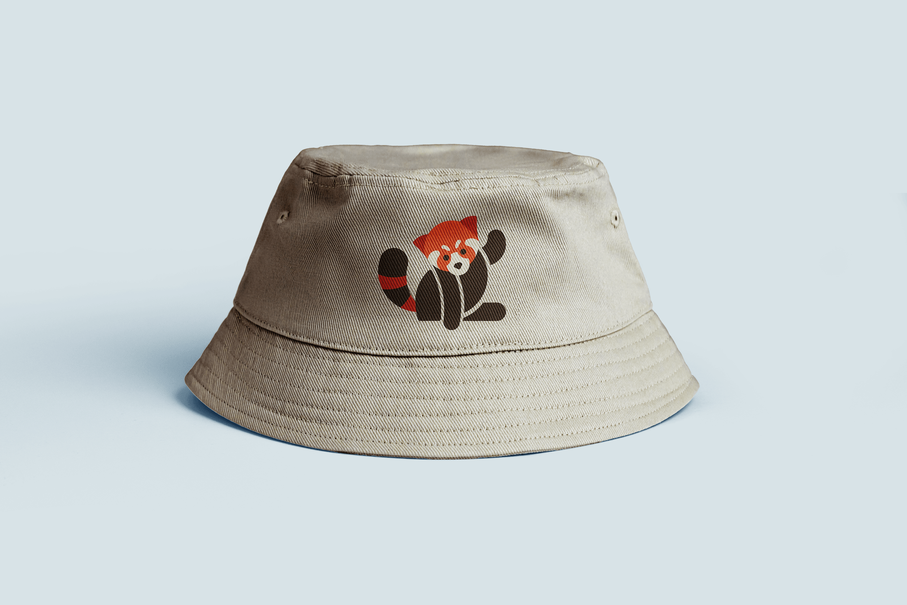
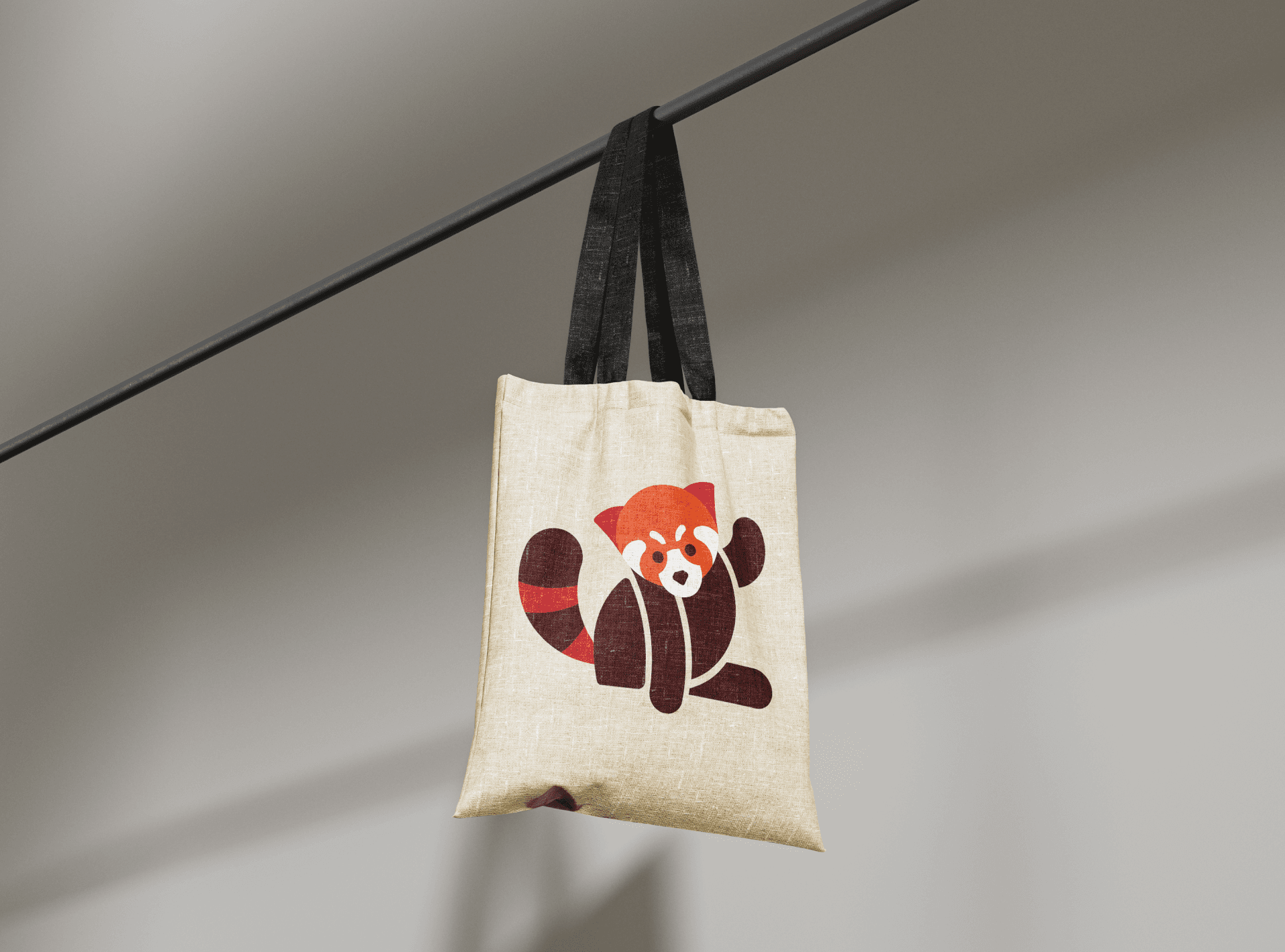
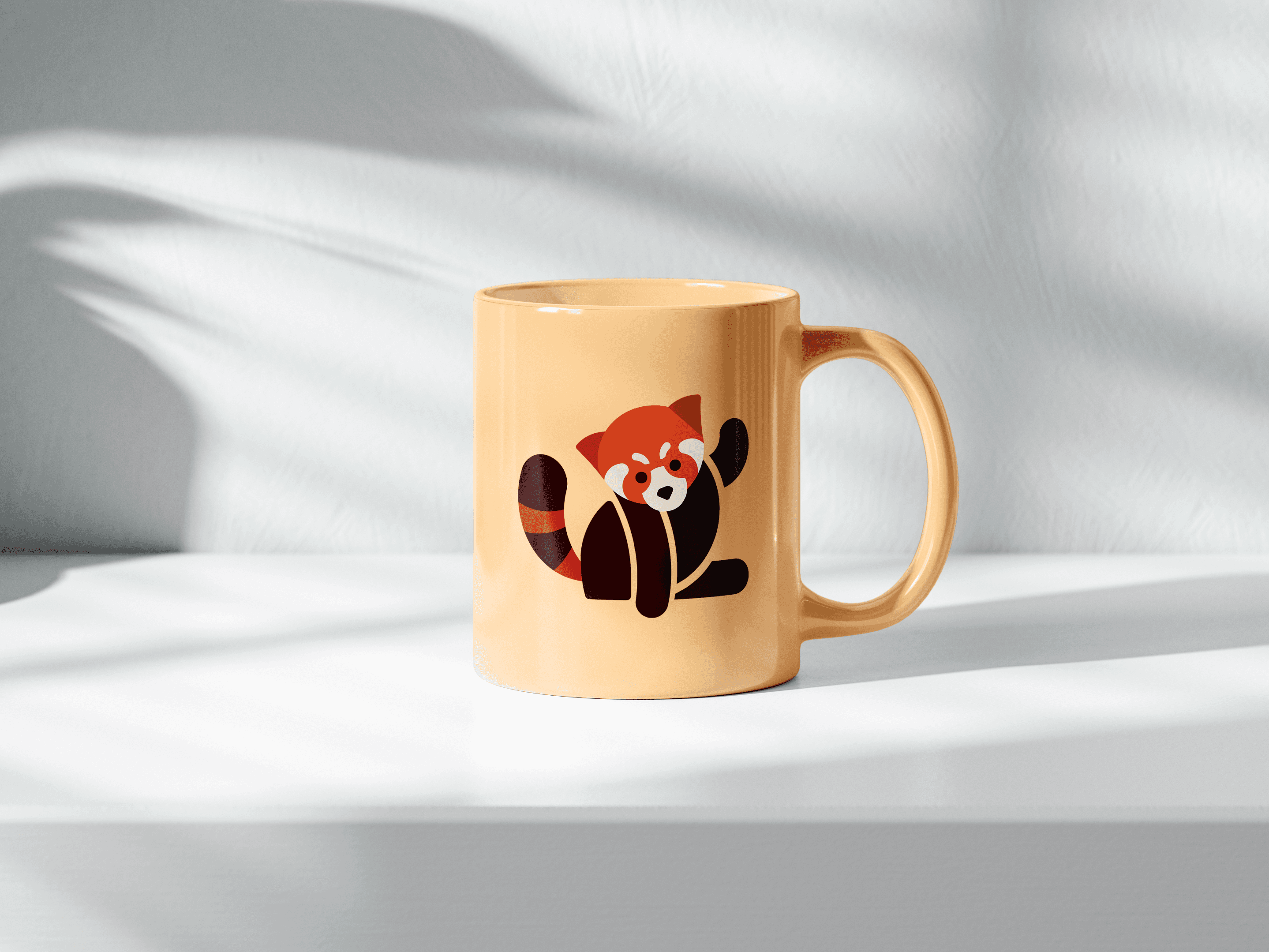
Primary Logo
Colour Palette
Illustration Overview
Billboards
Collaterals
#3F0D0D
R63, G13, B13
C0, M79, Y79, K75
#F1E5D7
R241, G229, 215
C0, M5, Y11, K5
Hex #DF6035
R223, G96, B53
C0, M57, Y76, K13
Hex #B8322F
R184, G50, B47
C0, M73, Y74, K28
The deep and earthy tones of Black Bean and Fire Brick echo the red panda's fur, capturing its distinctive and rich coloration. Flame, a vibrant red, further accentuates the energetic and playful nature of the red panda, adding a touch of dynamism to our brand identity. Almond, a neutral and soft tone, complements these vibrant hues, creating a balanced and visually harmonious palette.
Typography
Our exclusive font comprises three distinct styles: a rich Display weight, a bold Primary weight, and a practical Secondary weight. This versatility enables us to convey our message effectively across various communications while maintaining a consistent brand identity.
Baloo Tammudu Bold
Headlines
Baloo Tammudu Regular
Subheadlines
Arial Rounded MT Bold
ABCDEFGHIJKLMNOPQRSTUVWXYZ
abcdefghijklmnopqrstuvwxyz
1234567890
BodyCopy
Tagline
The tagline "Your go-to for endless fun" perfectly captures Ponyo's essence as a brand dedicated to bringing joy and excitement to kids' lives. It emphasizes our commitment to providing a wide range of products that spark creativity and foster imagination, making Ponyo the ultimate destination for fun-filled experiences.We'll use this tagline across all our marketing channels to highlight Ponyo as the go-to brand for endless fun-filled experiences.
“Your Go-To For Endless Fun”
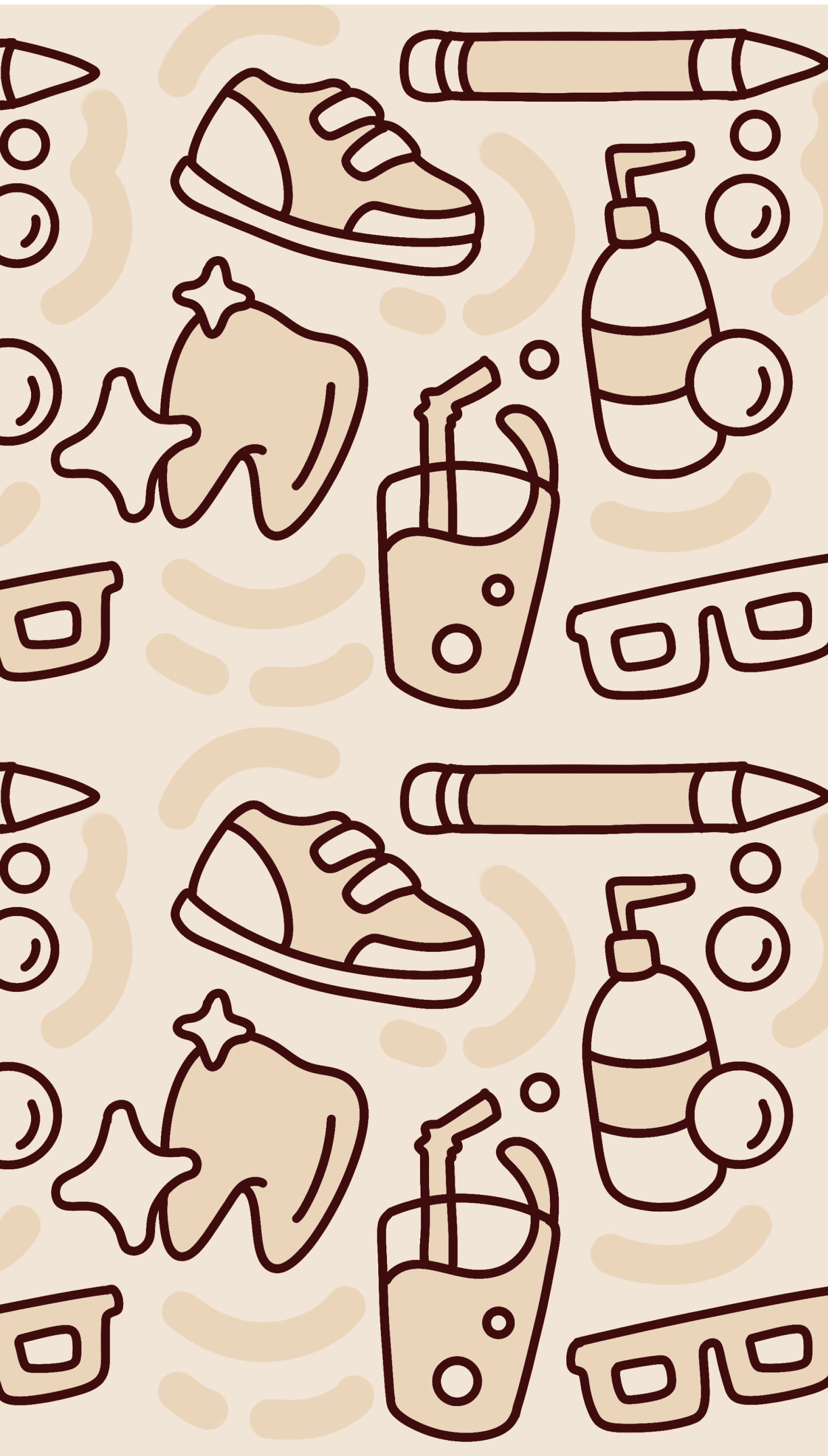
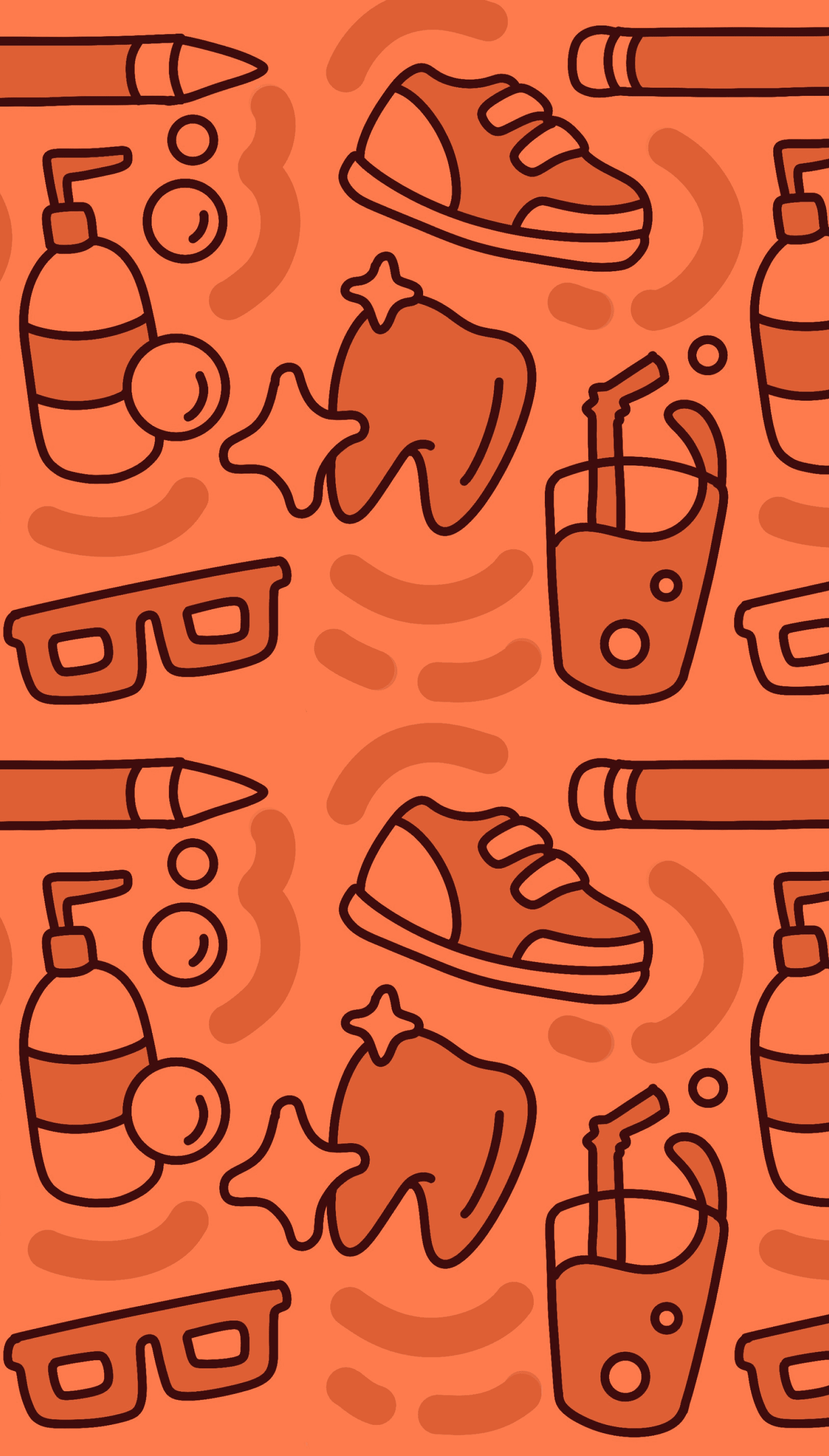
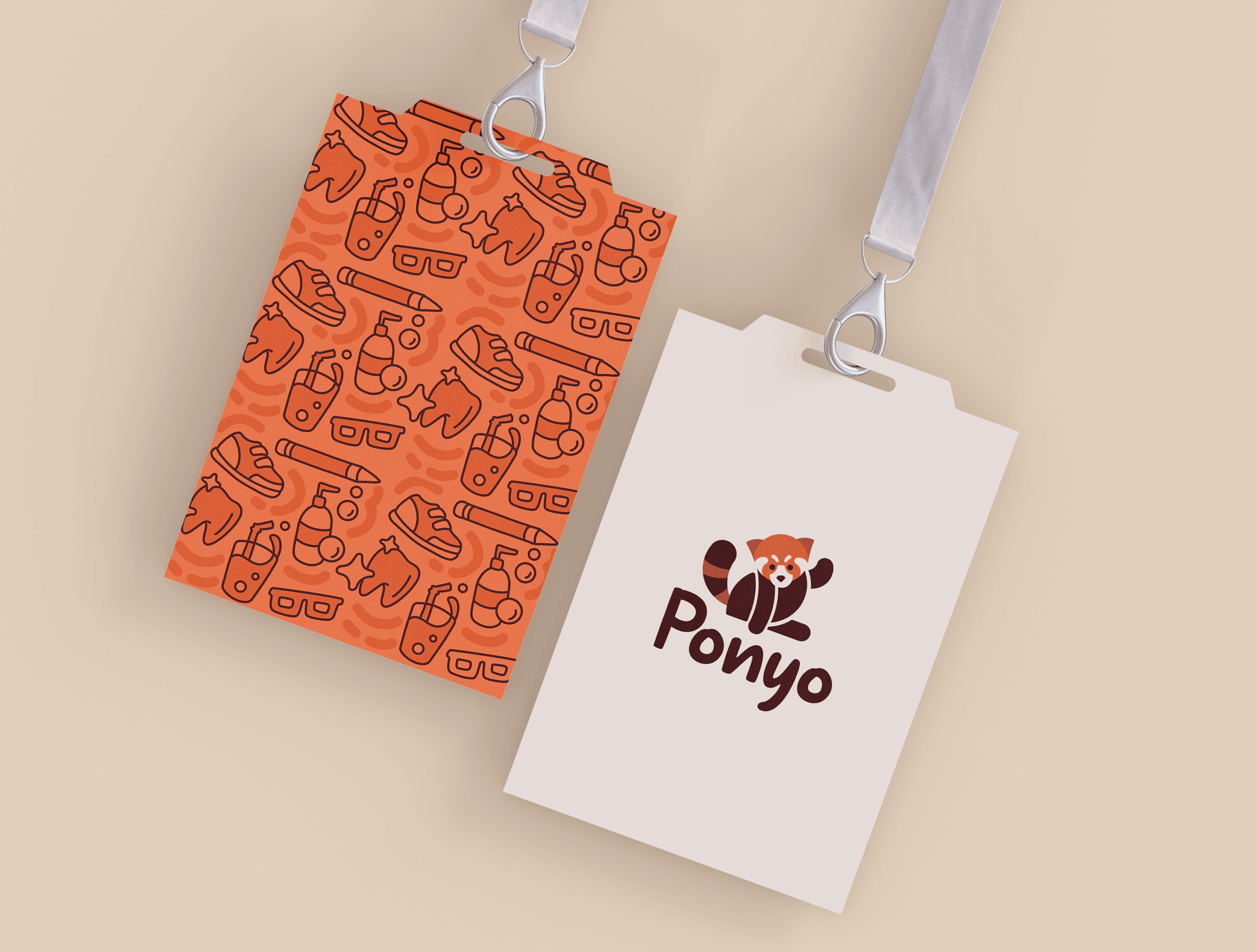
The illustration style employed here is characterized by simple line art doodles that exude a childlike innocence. These doodles encompass various categories such as kids' footwear, oral care, stationery, eyewear, hair and skincare, and flavored milk. These illustrations have the potential to be animated in packaging, social media posts, prints, and more.
Introducing
Ponyo
“Your Go To For
Endless Fun !”
Embark on endless adventures with Ponyo, where imagination thrives and smiles abound
Introducing
Ponyo
“Your Go-To For
Endless Fun !”
Embark on endless adventures with Ponyo, where imagination thrives and smiles abound !
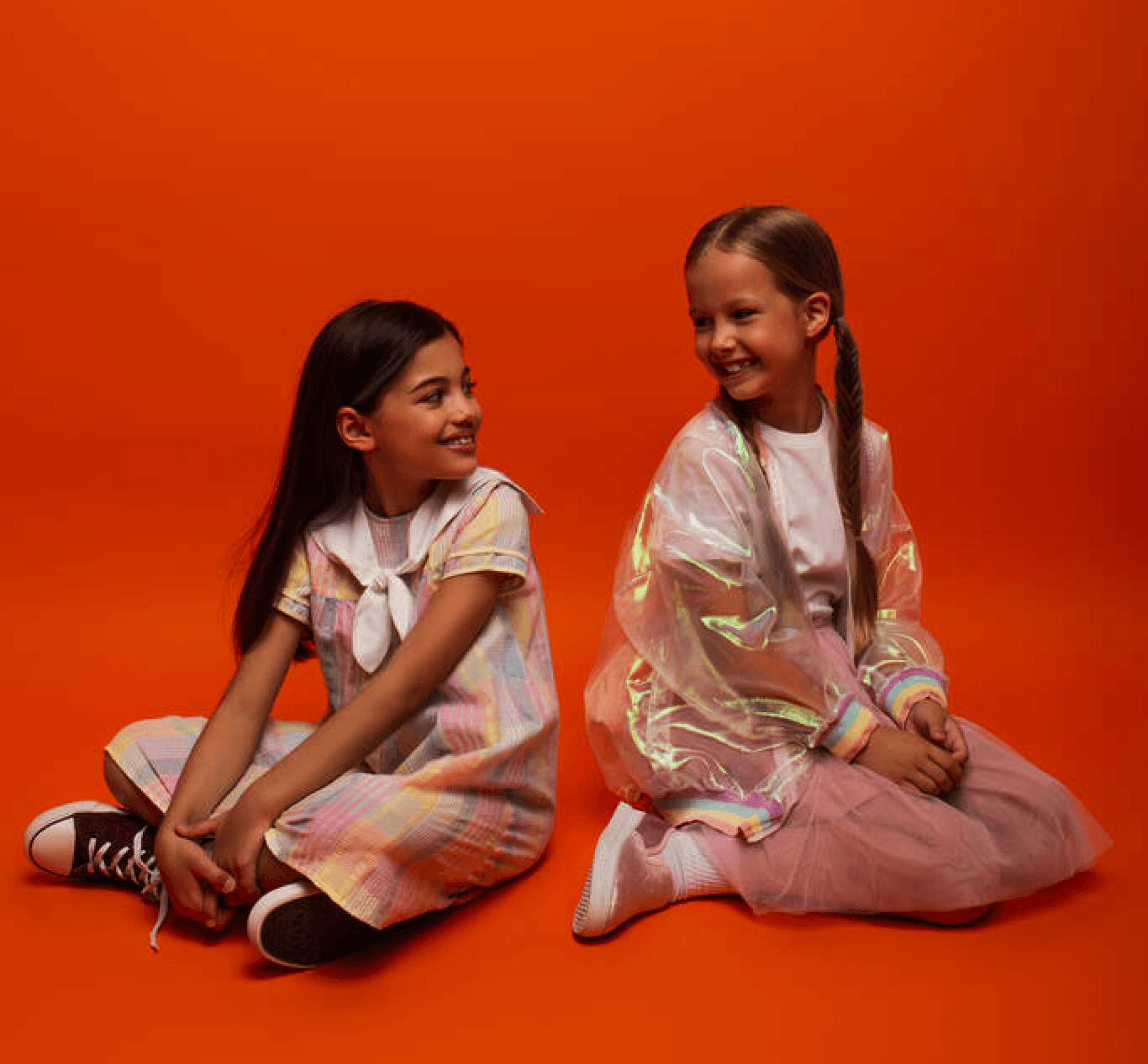

Children aged 4 to 12 years old represent our primary target audience. These young individuals are the core focus of our brand, as we aim to provide them with high-quality, playful, safe and eco-friendly products that cater to various aspects of their lives, including health, fashion, and education.
Parents of children aged 4 to 12 years old form our secondary target audience. We recognize the crucial role they play in making purchasing decisions for their children. Our goal is to resonate with these adults by offering products that prioritize sustainability, safety, and overall well-being for their kids, aligning with their values and preferences
ABCDEFGHIJKLMNOPQRSTUVWXYZ
abcdefghijklmnopqrstuvwxyz
1234567890
ABCDEFGHIJKLMNOPQRSTUVWXYZ
abcdefghijklmnopqrstuvwxyz
1234567890